Lucidity: the system behind the screens.
A 2025 engagement translating an existing UX direction into a shipped product interface. Built the visual language, type and color system, layout grids, iconography and component library. Handed the team a Figma library and documentation that has held up across four releases.
From concept deck to shipped UI.
Lucidity arrived with a strong UX direction already defined and a deck full of conceptual screens. What it did not have was a visual system, a component library, or any documentation that would let the engineering team build it more than once.
My job was to close that gap, end to end.
Audience first, then features.
The first month was definitional work: who the product is for, what it actually does, and what visual register feels appropriate to that audience. Only after these answers were locked did the visual exploration begin.
This sequencing matters. Every later decision becomes a derivation of these three. Skip them and you spend the rest of the project rationalising arbitrary choices.
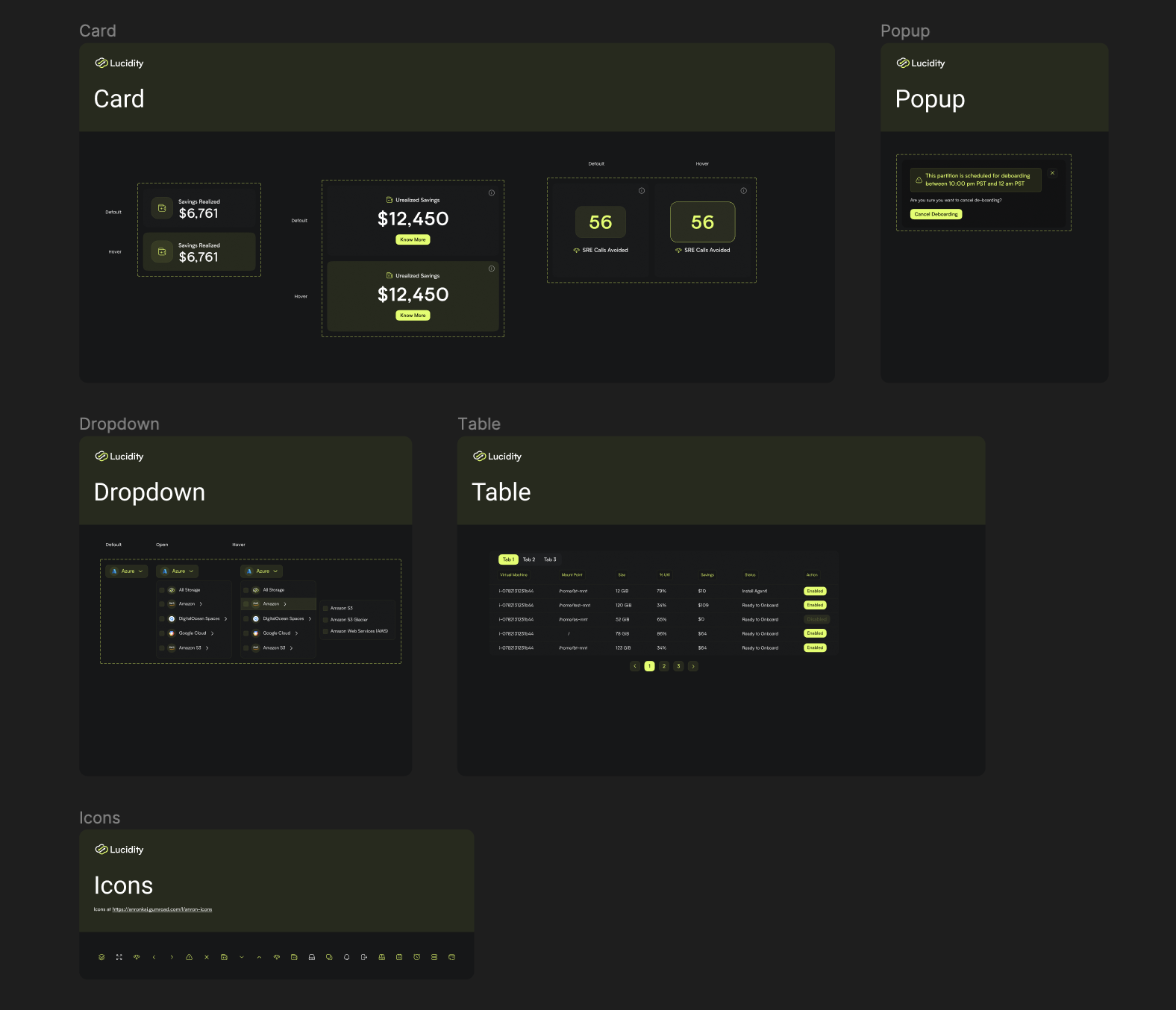
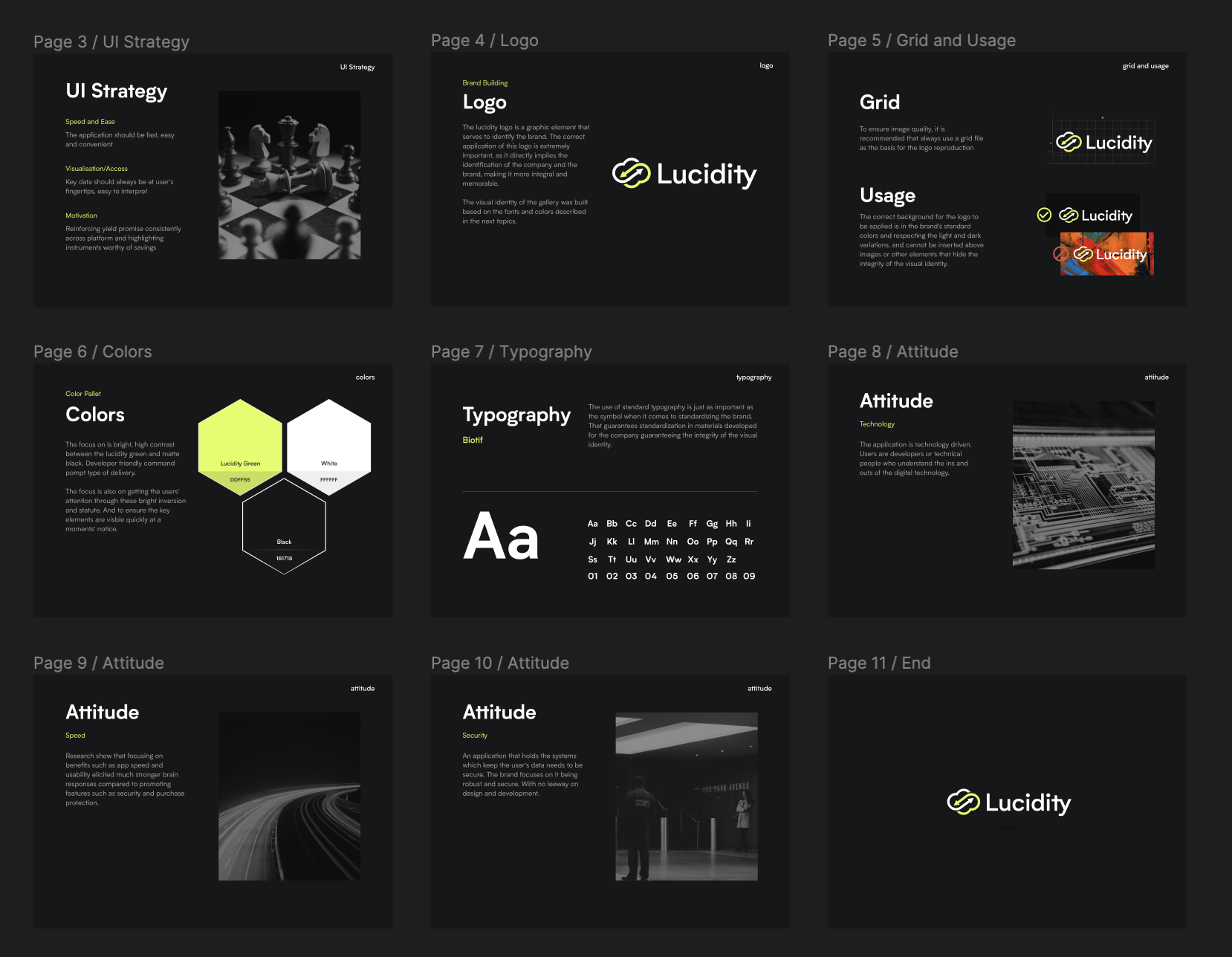
Tokens, components, governance.
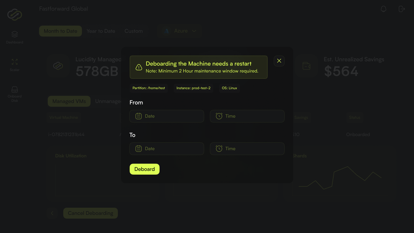
The system covers typography, colour, grid, iconography, and a component library with clear states and accessibility contracts. Documentation lives next to the Figma library rather than in a separate site, so updates are visible the moment someone reaches for a component.
Governance is light but real. Every component has an owner, every change has a rationale, and the library is treated as production code rather than a design asset.
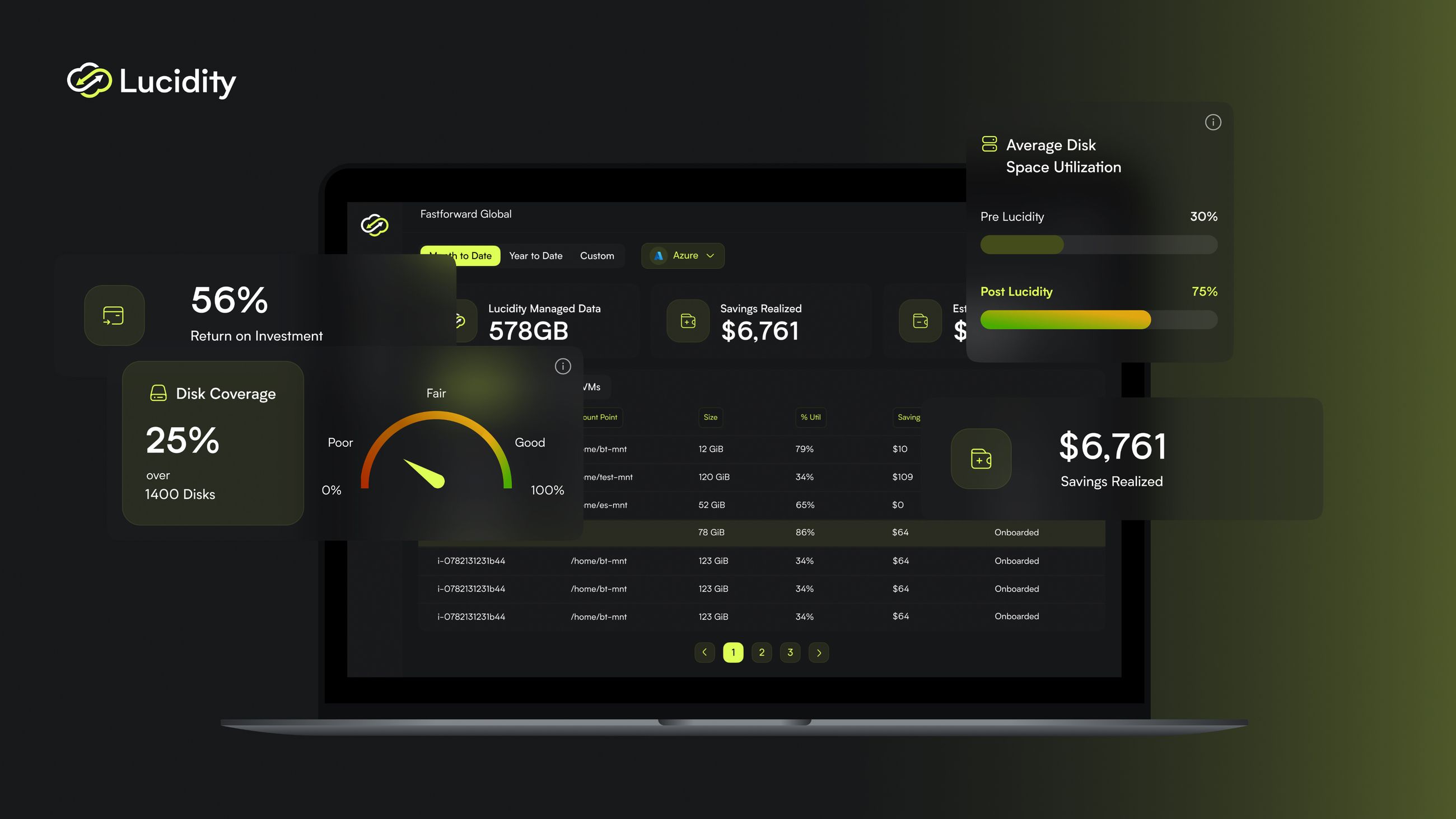
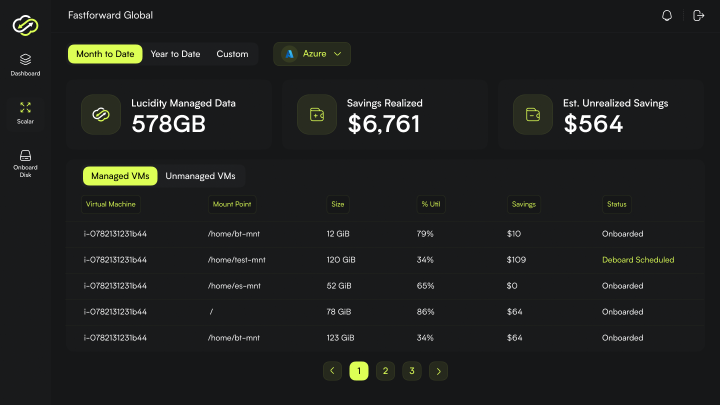
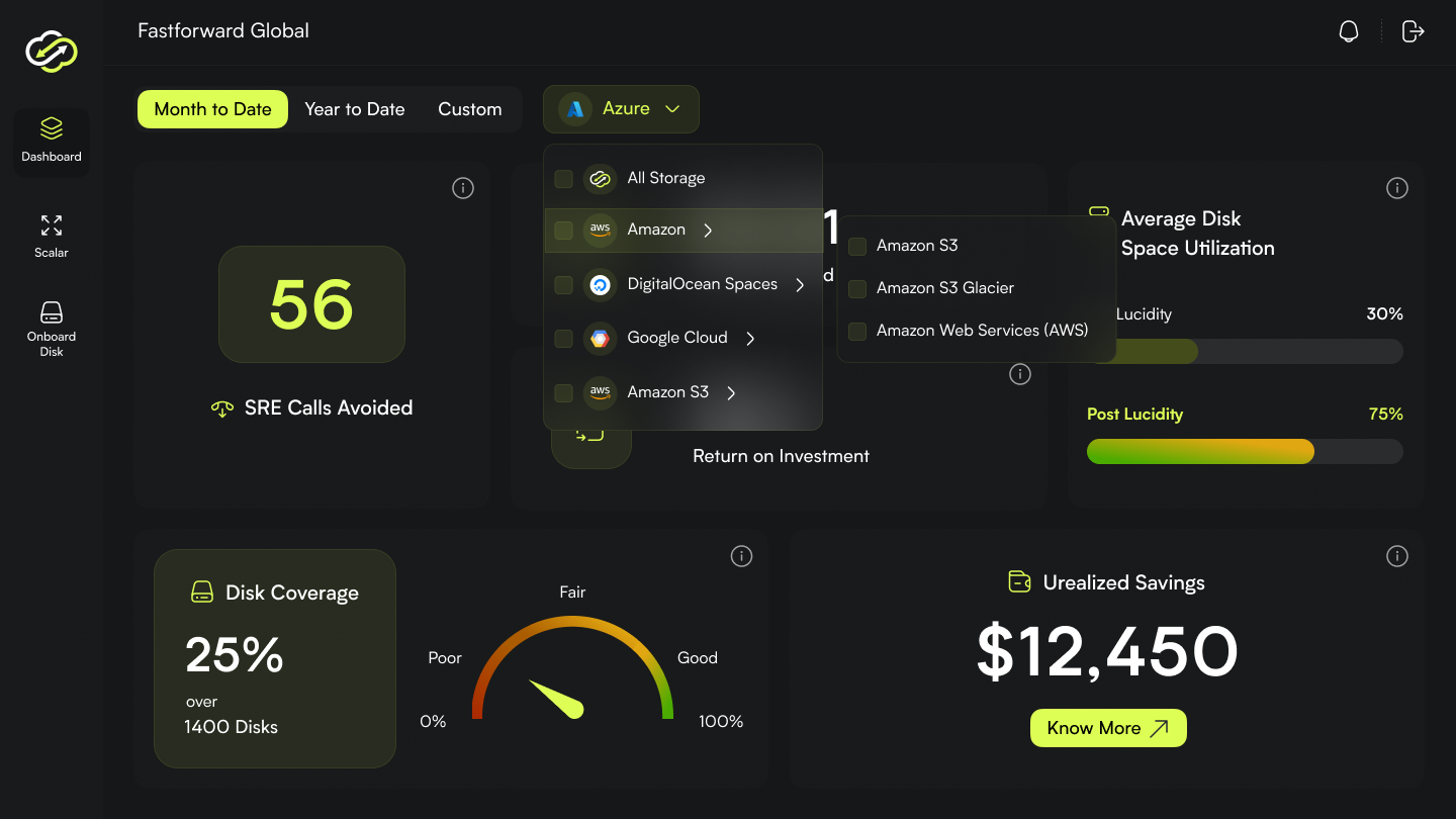
Held up across four releases.
The system shipped, was adopted by the team without resistance, and has now survived four major product releases without significant rework. New surfaces inherit the right defaults. Refactors happen in one place.
The best evidence of a useful design system is that it disappears into the work that uses it.